loading
0%

Ping Us!

AIDBEES
Logo & Brand Identity

www.aidbees.org

Overview

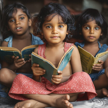
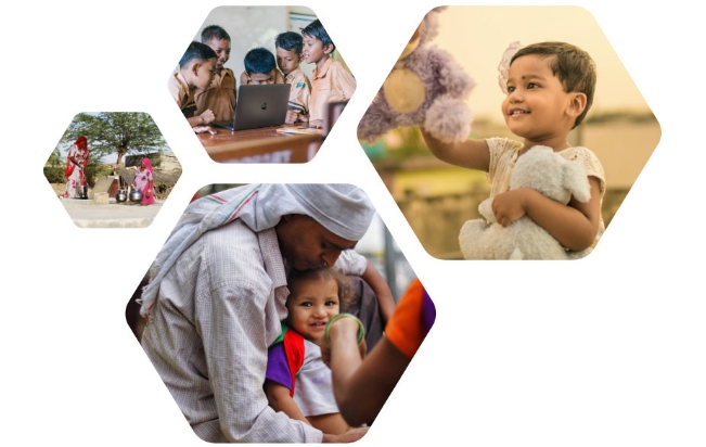
Aidbees is a digital platform dedicated to spreading social kindness through charity, volunteering, and meaningful community actions. Wide Lens was engaged to create a complete visual identity system — including the Aidbees logo, tagline usage, colour palette, typography, imagery style, and brand applications. The goal was to capture the spirit of kindness, positivity, and community in a clean, modern, and emotionally resonant identity.

Objective

  • Develop a logo that symbolically represents kindness, upliftment, and the “bee” community metaphor.
  • Build a cohesive brand system with guidelines for colours, typography, imagery, and digital/print usage.
  • Create a visual language that feels warm, positive, friendly, and aligned with the social-good mission of Aidbees.
  • Ensure consistency across all brand touchpoints — digital platforms, campaigns, merchandise, and partner collaterals.

Key Challenges

  • Creating a symbol that embodies both kindness and the literal concept of a bee, while also integrating the brand initials.
  • Designing a system that maintains emotional warmth without losing professionalism.
  • Ensuring the brand works seamlessly across diverse mediums: social media, banners, merchandise, and partner-driven collaterals.
  • Creating strict guidelines to maintain brand integrity when used by partner NGOs or collaborators.

Our Approach

Logo Concept & Identity Development

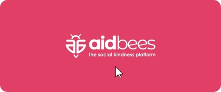
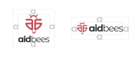
The logo visualizes a bee formed using the letters ‘a’ and ‘b’, symbolizing the user of the platform who is always rising upward — representing how kindness elevates people. This conceptual explanation is detailed on page 4 of the brand book.

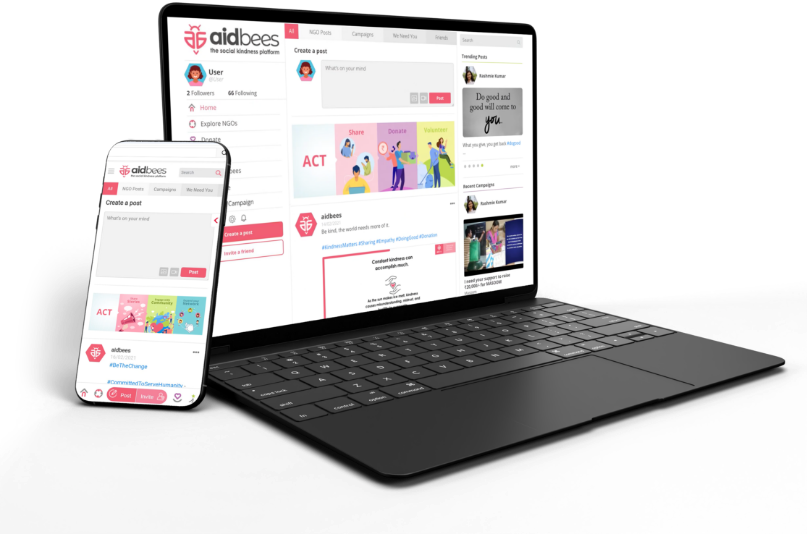
The tagline “the social kindness platform” was incorporated into multiple logo formats to underscore Aidbees’ mission across all touchpoints.

Brand Guidelines & System Design

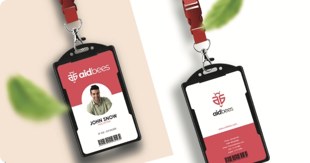
Wide Lens developed a full brand rulebook including:

  • Voice & Tone: informative, positive, conversational.
  • Partner-brand logo usage protocols.
  • Primary & secondary colour palettes featuring warm pinks (Carnation), monochromes (Tundora), and neutral linens.
  • Typography system using Century Gothic as primary and Open Sans as secondary.
  • Moodboards & imagery guidance emphasizing warmth, authenticity, and human emotion.
  • Illustrations & iconography using flat, minimalistic, 2D visuals aligned with brand colours.

Brand Guidelines & System Design

  • Business cards, letterheads, catalogues.
  • ID cards, social media layouts.
  • Pen drives, caps, T-shirts, mugs.
  • Media banners in multiple aspect ratios along with usage rules.

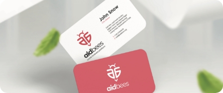
These applications show how the identity scales across digital and physical mediums.

Results

  • Delivered a complete, emotionally resonant brand identity that brings Aidbees’ mission of kindness to life.
  • Established a visual system that balances warmth, simplicity, and professionalism.
  • Provided detailed guidelines ensuring consistency when used by internal teams, partner NGOs, and external collaborators.
  • Strengthened Aidbees’ ability to communicate clearly and inspire participation across social platforms and campaigns.

Impact

The Aidbees identity crafted by Wide Lens gives the platform a strong and memorable visual presence. With its thoughtful symbolism, warm colour palette, and emotion-driven imagery, the brand successfully communicates its purpose: encouraging people to spread kindness. The brand book ensures continuity and clarity as Aidbees grows and expands its community initiatives.

Collaboration Stories