loading
0%

Ping Us!

Dualroots
Logo & Brand Identity

www.dualroots.ai

Overview

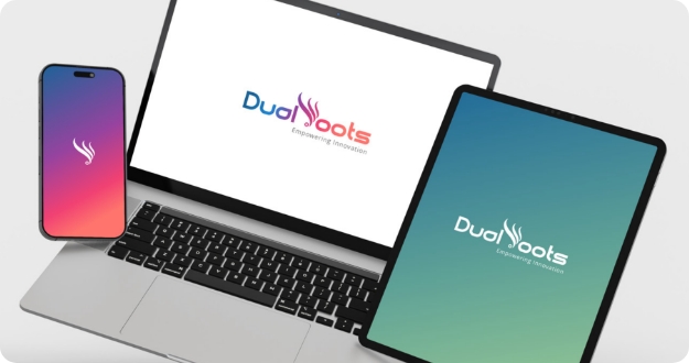
Dualroots is an emerging IT and software solutions provider focused on scalable technology, innovation, and end-to-end digital services. Wide Lens was tasked with crafting a complete visual identity — including logo design, typography, colour palette, and full brand guidelines — to establish a strong, modern, and professional brand presence. The goal was to create an identity system that reflects Dualroots’ commitment to Empowering Innovation while offering consistency across digital and print touchpoints.

Objective

  • Develop a unique, meaningful logo representing Dualroots’ core values of growth, technological flow, and innovation.
  • Build a complete brand system: colours, typography, imagery, iconography, and application guidelines.
  • Ensure the identity is clean, modern, and scalable across digital, print, and product applications.
  • Provide a brand book that ensures consistency as the company expands.

Key Challenges

  • Creating a logo that balances creativity with technological sophistication.
  • Designing a system that works across diverse use cases: websites, stationery, social media, merchandise, and digital ads.
  • Ensuring brand consistency through detailed guidelines without restricting creative flexibility.

Our Approach

Logo Concept & Identity Development

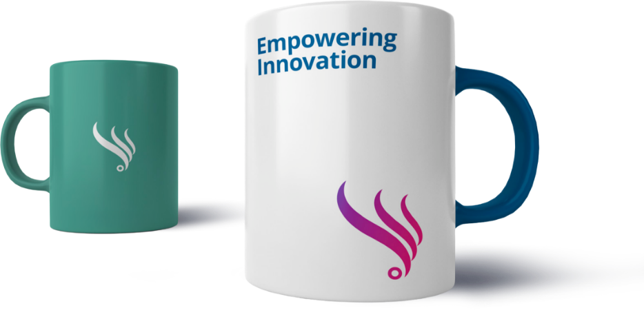
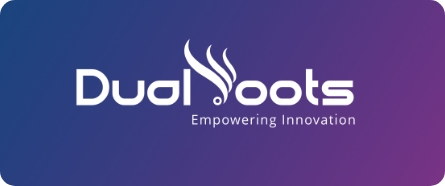
The Dualroots logo was built around a spiral, fluid design that represents the flow of ideas and growth. The base circle symbolizes the core, while the ascending curves reflect scaling, progress, and technological empowerment.

Customized typography reinforces a modern and professional personality aligned with the brand’s tech-driven values.

Brand Guidelines & System Design

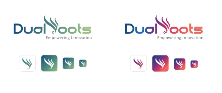
Wide Lens developed a full brand rulebook including:

  • Logo variations, margins, and incorrect usage.
  • Primary and secondary colour palettes focused on professionalism, innovation, and energy — including Deep Sea Blue, Teal Green, Vivid Sky Blue, Pale Mint, Raspberry Red, and Coral.
  • Typography system using Montserrat for headings and Lato for body text, ensuring clarity and modernity.
  • Imagery guidelines featuring abstract technology visuals, collaboration themes, and growth-oriented photography.
  • Iconography and visual elements designed in minimal, geometric style for tech-friendly communication.
  • Image overlays and colour-tinted visuals to maintain consistency across media.

Application Blueprint

  • Stationery: business cards, letterheads, IDs.
  • Digital media: banners, social templates, email signatures.
  • Merchandise: mugs, T-shirts
  • Device mockups demonstrating digital compatibility.

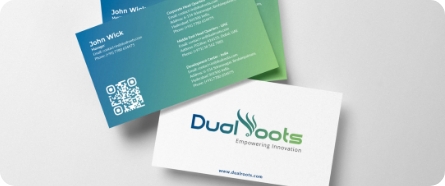
These applications ensured the brand feels cohesive, credible, and future-ready across all touchpoints.

Results

  • Delivered a complete, scalable identity system that strengthens Dualroots’ presence in the competitive IT industry.
  • Established a modern, professional, and technology-forward brand tone consistent across digital and physical environments.
  • Enabled the Dualroots team to maintain uniformity in communication through a well-structured brand book.
  • Provided a visual identity that reflects their mission of Empowering Innovation and supports long-term brand recall.

Impact

The Dualroots branding serves as a strong foundation for the company’s future growth. With a well-defined visual system and detailed guidelines, the brand can communicate with clarity, professionalism, and innovation — essential traits for a rising leader in IT and software services.

Collaboration Stories